

Andromeda Collective
Role: UX/UI Designer
Tools: Figma, FigJam, Miro
Project Duration: 6 Weeks // 2024
Background
For the second project of the Google UX Design course, I chose to design a website and mobile app for a public art museum. This posed an interesting challenge to me because trying to find the balance of best representing the musuem and it's "morals" while also providing an amazing user experience.
The Problem
Planning for a trip to the art museum should be fun and exciting for visitors. A site should give visitors a preview of what they have to look forward to but that is often not the case. Many museum sites have poor navigation, outdated design, events and info hidden behind paywall, and not options for easy access during visits. These challenges can start off the experience for visitors in a terrible way or even convince them it’s not worth the trouble to visit.
The Solution
The Andromeda Collective is a website and mobile app for a public art museum by the same name. The site provides easily accessible museum information to help patrons schedule future visits and promotes the most outstanding exhibitions and events available. The Andromeda Collective is crafted to give visitors a taste of the museum before even stepping through the doors.
Planning for a trip to the art museum should be fun and exciting for visitors. A site should give visitors a preview of what they have to look forward to but that is often not the case. Many museum sites have poor navigation, outdated design, events and info hidden behind paywall, and not options for easy access during visits. These challenges can start off the experience for visitors in a terrible way or even convince them it’s not worth the trouble to visit.
The Problem
The Andromeda Collective is a website and mobile app for a public art museum by the same name. The site provides easily accessible museum information to help patrons schedule future visits and promotes the most outstanding exhibitions and events available. The Andromeda Collective is crafted to give visitors a taste of the museum before even stepping through the doors.
The Solution
.jpg)
Language Accessibility
Virtual experience opportunities
Clear & visually stimulating UI
Mobile app cohesiveness to website
01 Empathize
Affinity Map
I conducted user interviews in order to better understand visitors' habits and problems. I then organized the responses using an affinity map to identify patterns and prioritize issues to target.
.jpg)
For the competitor analysis, I explored six different art museums websites and mobile apps. The list of competitors included both large, more popular museums in addition to smaller, more local museums. After analyzing the following museums, I compiled a list of important challenges to address for the Andromeda Collective.
Competitive Analysis

_edited.jpg)
_edited.jpg)
_edited.jpg)
_edited.jpg)
_edited.jpg)
User Persona
Based on the user interviews conducted I was able to generate a user persona that is representative of key audience targets. This persona helps identify the most important needs to address based on the majority of expected users. Let’s meet Jolie…
.png)
02 Define
Site Map
03 Ideate
.png)
User Flow

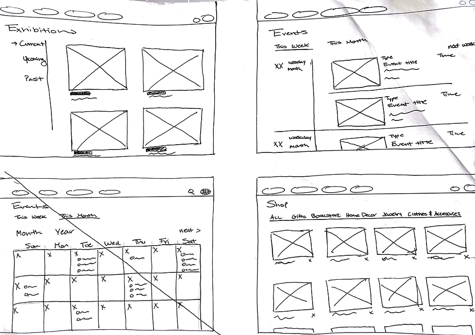
Paper Wireframes
With a clearer picture of the necessary features for the application, I began sketching out the main wireframe screens.
After gaining a better understanding of the users wants and needs, I developed an application map to layout essential pages and features.
.png)
%202.png)
%204.png)
.png)
%206.png)
%202.png)
%205.png)
%207.png)
%208.png)
(Web)
(Mobile)
Once I created the site map for the Andromeda Collective, I moved on to develop a user flow. This flow highlights the essential pages and the way in which a user is most likely to navigate the site. The flow is fairly simple with the primary goals of a user being to locate museum information and purchase tickets.
.png)
%206.png)
%202.png)
%205.png)
%207.png)
%208.png)
.png)
%202.png)
%204.png)


05 Test
Priority 0
We found user tasks may be completed faster by expanding the home page options of the web layout.
Priority 1
Users liked the category options for the 'Shop' page, but want page filter options and categories for the 'Events' page as well.
Priority 2
Users would benefit from an audio option for descriptions similar to exhibition dialogues.
Usability Findings
Usability Study Details
Research Questions
How long does it take a user to select tickets & complete checkout?
Were users able to find basic, but essential, museum information easily and quickly?
Were users able to identify exhibitions available for a visit?
Were users able to find events they might be interested in?
Are there parts of the user flow where users get stuck?
Are there more features that users would like to see included in the app?
Do users think the app is easy or difficult to use?
Participants
6 participants
-
Three men
-
Three women
-
Age Range: 20 - 55
Methodology
15 minutes per participant
United States (remote)
Unmoderated Usability Study
Users were asked to perform tasks on a high-fidelity prototype


Final Prototype
Updated Screens
.png)
Prototypes
.png)
.png)
.png)
.png)
Priority 0
Priority 1
Priority 2
The first update made to the prototype was expanding the home page of the website. This allows the user to browse easily and can help improve their navigation speed especially upon a first time visit to the page. Additionally, it improved one of the initial challenges which was cohesiveness between the website and mobile app. While the home pages can't match exactly, the order and layout is more similar to help reduce confusion. The second update was adding filter drop downs to the 'Events' and 'Shop' pages. This change makes it faster and easier for users to find specific items. The final change was to add an audio option for exhibits and events. This helps improve accessibility and provides a mobile option while visiting the museum.
Reflection

Next Steps
During usability testing one user mentioned that figuring out the best paths/routes through exhibits was difficult, so it may be beneficial if other users face similar challenges. This could be addressed by providing recommended walking routes in addition to the museum map page. Overall, more extensive usability study will need to be conducted based on the final prototype to determine if the user flow can be improved.
What I Learned
This project was unique to me because of the challenge of balancing the artistic and creative nature of an art musuem while maintaining clarity and simplicity needed for an outstanding user experience. Through out the design process I learned that sometimes simple is the most beneficial. In the beginning I struggled because I wanted a unique design to portray this museum. However, I found that users were more likely to book or want to revisit if they clearly understood what was going on and the process was easy. The most important takeaway for me was how essential it is to make sure an app or site isn't convoluted or overwhelming for a user because it's one of the quickest ways to get them to give up and click out.
I hope you enjoyed this case study. Check out my other work.
Thank You!
During usability testing one user mentioned that figuring out the best
paths/routes through exhibits was difficult, so it may be beneficial if other users face similar challenges. This could be addressed by providing recommended walking routes in addition to the museum map page. Overall, more extensive usability study will need to be conducted based on the final prototype to determine if the user flow can be improved.


%20(1).png)
.png)

.png)
.png)
.png)
.png)
.png)